

Chelsie Hamil
Hi everyone — I’m slowly moving my portfolio over. You can check out the new site here: chelsiehamil.webflow.io
Creating a design hub for everything Toyota.
The Brief
Build a centralized platform for Toyota’s brand guidelines, design systems, and assets — accessible to both internal teams and external partners.


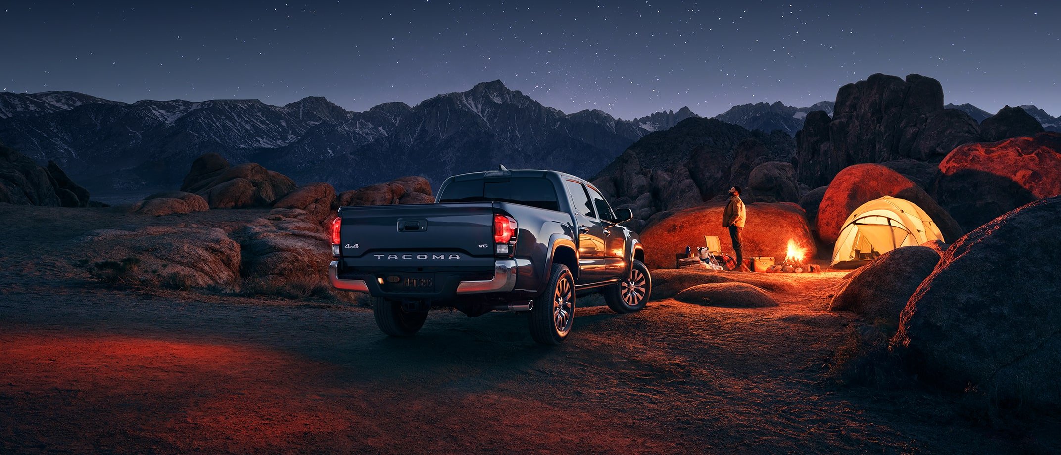
We were limited to existing photo assets, it was a small constraint and easy to work around
We grouped content into intuitive categories, prioritized quick access to high-traffic resources, and planned for growth — knowing new sections (like voice & tone or photography guidelines) would be added over time.
A closer look at Toyota’s iconic brand colors and how they’re applied across the system.


Toyota’s signature colors

This wasn’t just about building pages and components — we worked closely with our content partners to craft a cohesive, useful brand experience.

When general photography didn’t quite capture what we needed, our content team stepped in to create tailored visual assets.


Showing real-world examples was a must, but it pushed us to design components that could flex — whether they were supporting billboard imagery or fitting into a small mobile screen.

Adding interactivity was a fun goal throughout the project. Implementing sliders throughout the page, users can explore how color grading impacts the look and feel of Toyota’s photography.


Saturation, warmth, and contrast are the three pillars of Toyota’s approach to color grading.
The color grading story continues in Toyota’s video content, highlighting consistency across mediums.

Framing the Journey: Hyundai x Annie Leibovitz

Design a campaign platform that bridges Annie Leibovitz’s iconic visuals with Hyundai’s brand narrative.
The Brief


With visuals carrying the emotional weight, our role was to create a framework that felt editorial and respectful. We kept typography minimal, prioritized scale and breathing room, and ensured the experience felt cohesive across varying content — from static portraits to cinematic video moments.


Because the campaign featured both employees and owners, it was important to give their images equal visual weight.
On the live site we placed videos in a small card beneath the main content, keeping them accessible without drawing attention away from other stories.


The balance between photography and video was key to this project. By focusing on flexibility and strategic placement, we were able to give equal weight to both mediums while preserving a cohesive, emotionally resonant user experience.
Designing an AI assistant for one of the world’s most recognizable automotive brands.
In Production

The Brief
We were tasked with designing a branded AI assistant for Toyota.

With flexibility beyond Toyota’s standard brand system, we explored a range of shapes and colors for the chat CTA.
Developed different CTA treatments that could sit comfortably within the visual language of Toyota.com while signaling something new.


These custom icons were developed for Toyota’s AI assistant, blending brand cues with the now-ubiquitous AI star to create something that feels both recognizable and uniquely Toyota.
With flexibility beyond Toyota’s standard brand system, we explored a range of shapes and colors for the chat CTA.


Striking a balance between forward-thinking design and brand recognition through icon exploration.

Landing on a Look: Defining the Chat’s Visual Direction


After exploring many different icon styles and color schemes, we chose a direction that feels bright, fresh, and distinctly different — while still evoking the core spirit of Toyota.
